What You Will Do:

- Investigate the question: How does temperature vary across different areas of our campus?
- Watch the Khan Academy video: "Constructing a box and whisker plot."
-
As a class, brainstorm 3–5 areas in or near your classroom that you suspect may vary in temperature. Some examples:
- Near the entrance to your classroom
- Under a nearby tree or shady spot
- An open grass area
- Pavement
- Near a heater or air conditioner
- A location of your choice
- Predict the shape of the boxplot at your assigned location, then collect two minutes of temperature data there.
- Find the five-number summary and interquartile range (IQR) of your data, and compare the boxplots from every location as a class.
- Complete the Google Docs worksheet: "Microclimate Mapping" and turn it in according to your teacher's directions.
-
Investigative Question: a question for a statistical study that can be answered by collecting and analyzing data.
As a class, decide:
- the variables of interest,
- the type of inference (including the population parameters of interest), and
- the type of conclusion (including the largest population where the conclusion applies).
- Five-Number Summary: the minimum, first quartile (Q1), median (Q2), third quartile (Q3), and maximum of a data set. A boxplot is a picture of these five numbers.
- Median: the middle value of the data, also called the second quartile (Q2). When comparing boxplots, we often compare their medians.
- Interquartile Range (IQR): the spread of the middle half of the data, IQR = Q3 − Q1. We will compare our class data sets using their boxplots and IQRs.
-
Outlier: a value far from the rest of the data. One common test is the 1.5 × IQR rule:
a value is an outlier if it falls below the lower bound or above the upper bound.
$$\text{Lower Bound} = Q_1 - 1.5 \times IQR \qquad \text{Upper Bound} = Q_3 + 1.5 \times IQR$$
- Click the Khan Academy video on constructing box and whisker plots to learn more about these concepts.
- Click this link Microclimate Mapping to open the worksheet in a new browser tab. Click 'Make a copy' to save your version to your Google Drive.
- Which of the places around your campus or classroom do you think will have the most variability in temperature? Why do you think the temperature will vary the most in that location?
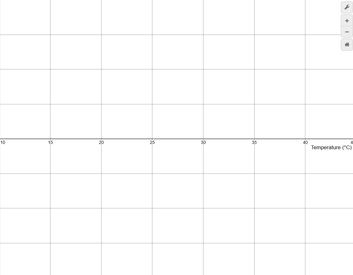
- Draw what you think the boxplot of temperatures at that location will look like. Use the drawing tools and your mouse to draw your prediction on the graph below. Click Erase Drawing if you need to start over.
- When you are satisfied with your prediction, click Capture Drawing to copy the image to the clipboard, then paste it into your Microclimate Mapping worksheet.
Directions:
Data Collection:
- As a class, brainstorm your investigative question and list the locations where you think the temperature will vary the most. These locations should be in your classroom or on your campus, based on your teacher's directions.
- When your teacher assigns your group a location, draw your boxplot prediction in the What Do You Think? section before you collect any data.
- Use a USB-C cable to plug the Observe temperature sensor into your computer's USB port.
- Click the Connect button at the top-left corner of this page.
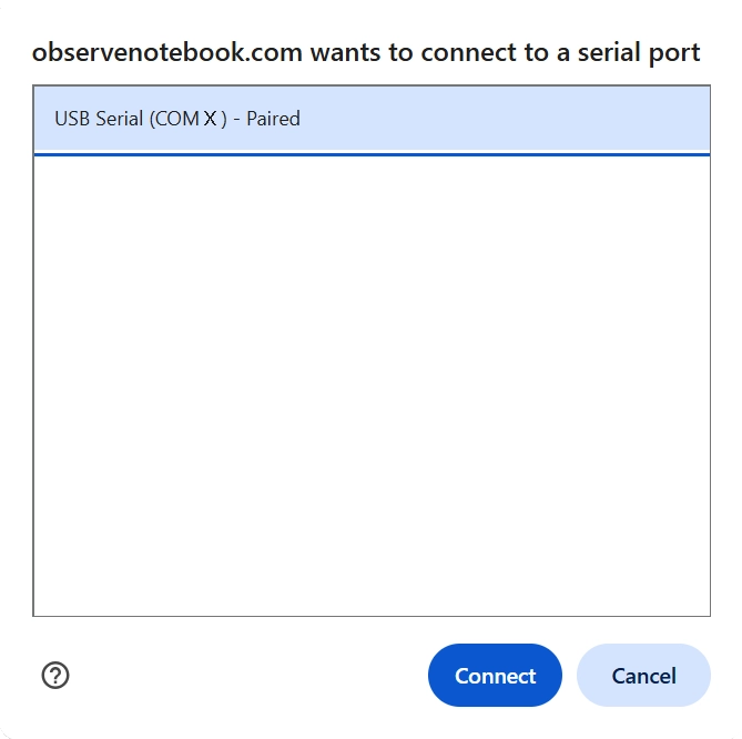
- Select the USB serial port (COM X) and click Connect. X varies by computer and is not important.
- Confirm that the status in the top-right corner says "ready (5 Hz)".
- With your group, move to your assigned location, leaving the sensor connected. Do not touch the metal part of the sensor.
- Click Start Collection to log data. Collection stops automatically after two minutes, or you can click Stop Collection to end early.
- Clear Graph resets the graph; Zoom to Data fits all collected data within the viewing window; Capture Graph copies the graph; Export / Import saves or opens a CSV data file.
- Click the Show Instruction button in the upper-right corner to continue the activity.
- Click the Show Directions in the upper-right corner to learn how to collect temperature data for this activity.
- On the next line below the data table in the Desmos calculator, type Stats(T) to find the five-number summary of your temperature data T.
- Record the measure of center for your boxplot (the median) in your worksheet.
- Find the first quartile by typing quartile(T, 1), and the third quartile by typing quartile(T, 3). Record both values.
- Find the interquartile range: IQR = Q3 − Q1. Record this value in your worksheet, then use the 1.5 × IQR rule to check your data for outliers.
- When finished, click Capture Graph to copy your graph and paste it into your Google Docs worksheet.
- When every group has found its measure of center and measure of variability, share them as a class. Record the values in your worksheet and use them to complete Part 3.
- Look back at your investigative question and use the class data to answer it.
- If time allows, repeat the investigation, but start with every temperature sensor in a cup of ice water. Remove the sensor from the ice water only when you are at your location and ready to collect data.
- How did the boxplots change compared with your first data collection?
- Record the new boxplots in your worksheet and use them to answer your investigative question again. Did anything change from your previous analysis?